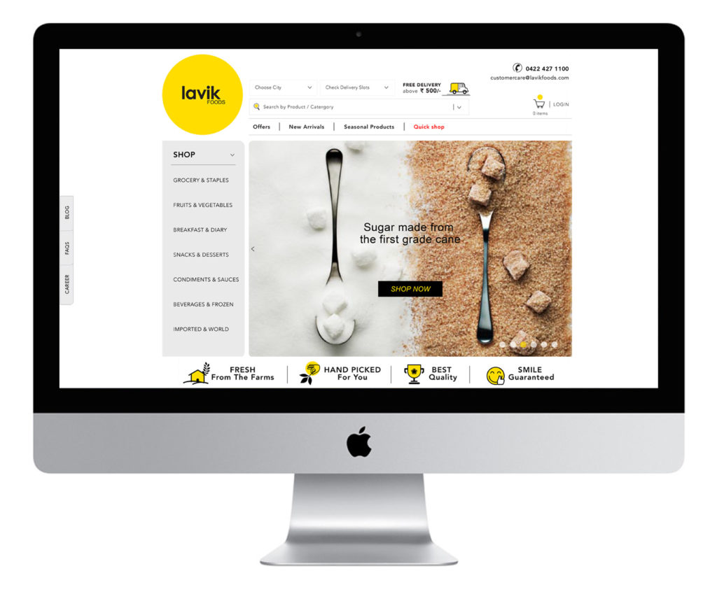
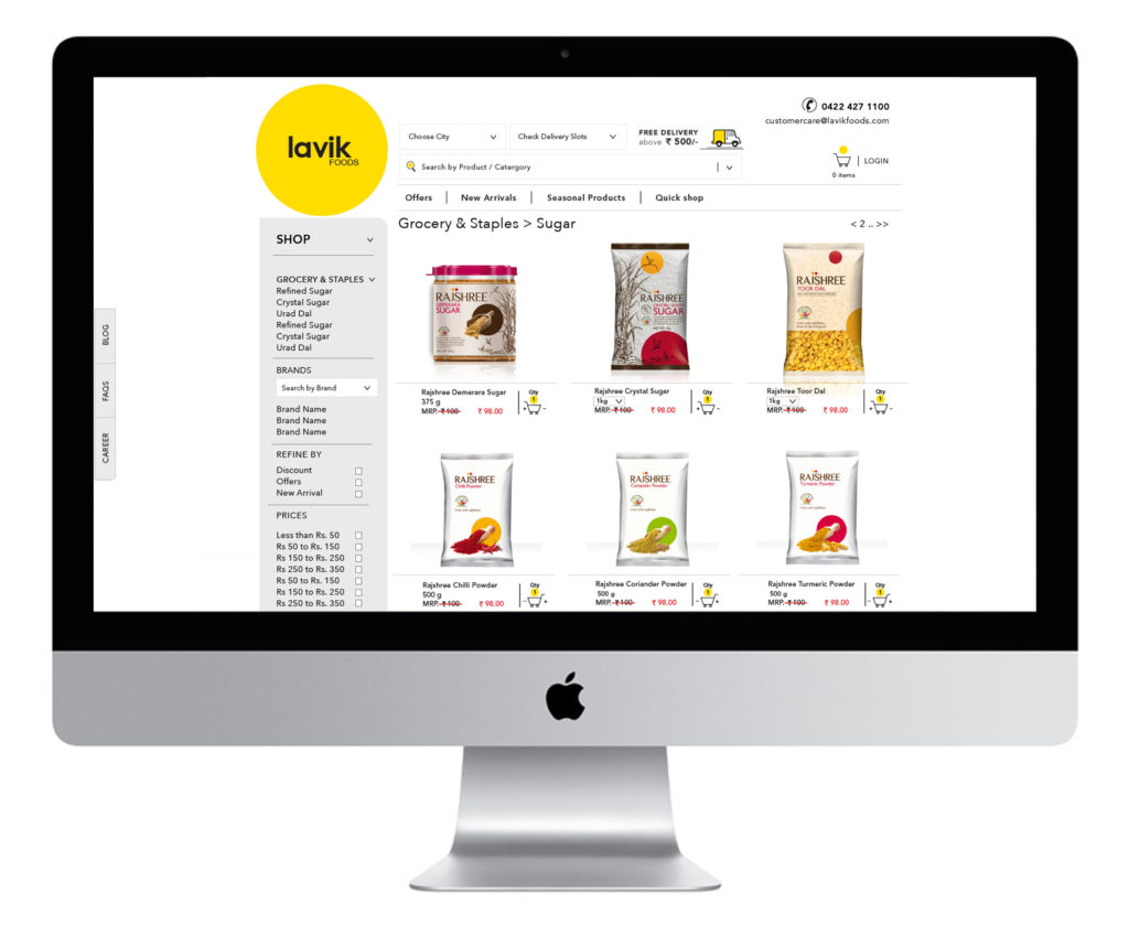
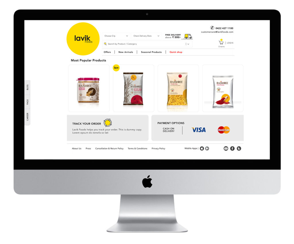
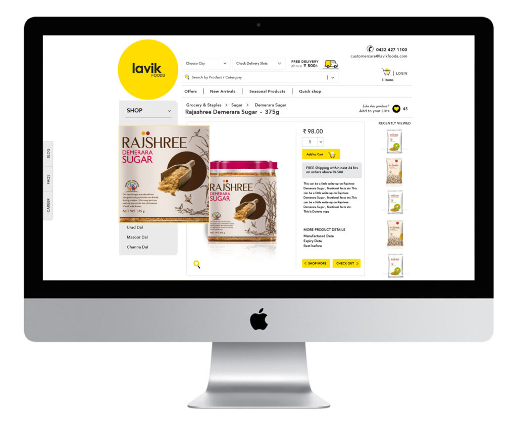
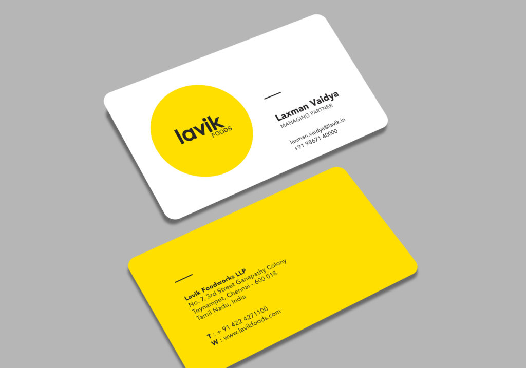
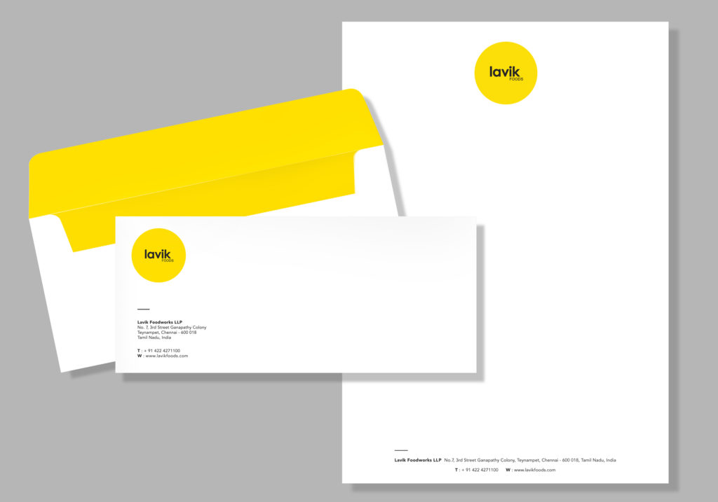
The work for Lavik Foods included branding identity design & stationary, website design, along with marketing collaterals.
WEBSITE DESIGN
TASK : Investigate a new layout for the homepage/ website and how it could translate across tablet and mobile.
Created a minimalist web design with negative, or “white”, space. White space serves to guide the user’s visual flow. It’s not so much about uninterrupted space as it is about creating balance and harmony between elements.
- As an e-commerce site, it also emphasises the content area and leads the reader from one element to another.
- Raised and floating buttons were created in the brands primary colour as the active icons.
- The buttons were placed at prominent locations along the site to help the customer to select the products and shop comfortably on the site along devices
